Faculty of Philosophy conferment logos
The Faculty’s logo has long served as the traditional emblem of these ceremonies, appearing in all conferment publications, from programme leaflets to books recording the events. In the 19th and early 20th centuries, these symbols functioned primarily as decorative vignettes rather than as logos in the modern sense, though they share many of the same characteristics. Nevertheless, it is difficult to draw a precise distinction.
In general, all significant organisations and businesses have their own graphic identifier, or logo. It may combine a graphic motif with the name, such as the star of Mercedes-Benz. In many cases, the symbol is so widely recognised that the name is no longer necessary. Another approach is to render the company name in a distinctive calligraphic style, creating a recognisable logo. A prime example is the world-famous Coca-Cola script.
In addition, major sporting events, important scholarly conferences and other significant occasions have traditionally used their own logos for decades. Even when an event is longstanding and held regularly, its logo highlights the distinct, individual and unique character of the occasion, remaining consistent over time, as exemplified by the Olympic rings.
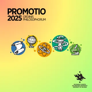
The logos used for conferment ceremonies typically incorporate a symbol associated with the academic world, reflecting scholarly ideals and drawing on themes of mythology, learning and wisdom. The most common symbols are a laurel wreath (or leaf) and a lyre. Other motifs have included the owl, linked to the goddess of wisdom Minerva, and the Ionic column, evoking ancient Greece as the cradle of learning, as seen in the University of Helsinki’s Main Building. The 1990 logo incorporates the year as well as the figure 350, marking the University’s anniversary at the time. The 1997 logo is rather inventive: at first glance, it appears to depict a lyre, but closer inspection reveals it to be formed from two doctoral swords positioned against each other, along with laurel leaves alluding to master’s wreaths.
Professor Lars Huldén, who attended the 2007 conferment ceremony as a jubilee doctor, composed a celebratory poem for the occasion, likening the University to a tree that blooms every few years in the form of a conferment ceremony. Each time it flowers, the tree is slightly different. Similarly, the conferment logo is always subtly altered, reflecting the visual style of its era. Conferment ceremonies are evolving continuums, connecting the past and present in multiple ways, including through visual elements.
Jukka Relas, PhD
My heartfelt thanks to Eva Ahl-Waris, PhD, MTh, for her collaboration.